via madebyjulene.com Handmade by Julene Harrison, http://madebyjulene.com
Inspiring Paper Graphic : Part One
via artyulia.com Handmade by Yula Brodskaya
Design It: Shelter Competition
via guggenheim.org Double G Team Up: The Guggenheim and Google are co-sponsoring a shelter competition. Only stipulation, the design must be made in Google SketchUp. I look forward to checking out the finalists, selected by current Frank Lloyd Wri...
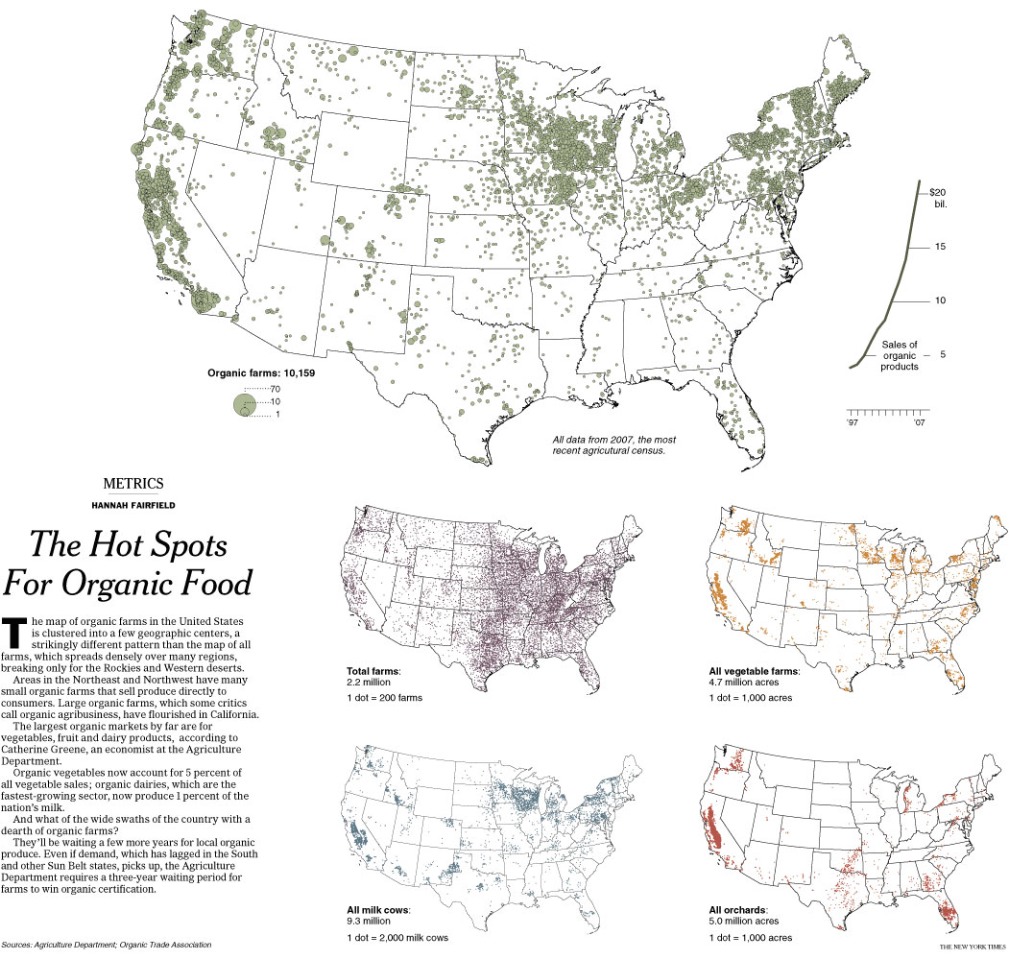
A Chart-r-ific diagram of publishing logos
via nytimes.com
Super Mario Coco Conan
via seriouslunch.blogspot.com The members of this household are loyal supporters of Conan O'Brien and we have eagerly awaited his debut on the Tonight Show. After reading about his brand new set (http://tinyurl.com/lnqjx3) we found this Serious Lu...
Blackwater Background
via underconsideration.com More information on the Blackwater/Xe logo, thanks to "Brand New." The general outsiders' consensus is that the extreme rebranding is an attempt by The-Business-Formerly-Known-As-Blackwater to distance itself from its re...
The Peepoo Bag ... yes, THAT kind of pee & poo
via peepoople.com The name says it all: A bag designed to hold a single "serving" of numbers 1 and 2. Once full and sealed up, the bag stays odor free for 24-hours and can then be buried where it will biodegrade into high-quality fertilizer. The b...
1 + 1 = 3, According to some optimistic design students
When viewed from a certain angle, an assembly of random stuff coalesces into a message. This "alternative meeting place" was put together for the Stockholm Furniture Fair by Product Design students from Beckmans College of Design in Sweden. via ht...
Corporate Facelifts

Too many green leaves. Also, I need to find out more about the Blackwater rebrand???from Tiger claw to Xe??? via http://www.nytimes.com/2009/05/31/weekinreview/31marsh.html
Counterpoint: The Power of Graphic Design
via nytimes.com The directors of Design for Democracy apply the easy-to-read Nutrition Facts box format to improve the readability of credit card "fine print."
Point: The Impotency of Graphic Design
via nytimes.com David Carr argues that Newsweek's recent redesign doesn't address the magazine's real problem that... "...the fight for its future probably doesn???t have much to do with bolder headline treatments and more white space in the print a...
June 1 New Yorker Cover
The latest New Yorker arrived yesterday featuring a dense, murky cover image. After checking the title ("Finger Painting" by Jorge Colombo) I thought, "Ahhh, he painted it with his fingers. That explains it!" I was partially correct. Colombo did c...
On-going topic: Visualizing Information


To start off, some of my favorite examples: * Dennis Wood, Jack-o-lantern Mapmore info: http://www.davidbyrne.com/art/tree_drawings
KCRW's Design and Architecture : Interview with Sir James "the vacuum" Dyson
Dyson discusses his new blade hand dryer (I can attest from first "hand" experience that it works extremely well) as well as the importance of encouraging young students to pursue engineering and science, if they are so inclined. According to Dyso...
1981 primitive Internet report on KRON
via youtube.com Via Frank Rich's column in today's Sunday Times.
Should Design Be Held Back by a Tyranny of Data?
via nytimes.com Another article about Douglas Bowman, who left his job as a visual designer at Google in March to become the creative director of Twitter. Bowman's move became a business/design/tech story after he wrote a post on his blog about hi...
New York City Opera Rebrand
In theory, I love this rebranding. In practice, it gives me anxiety???kind of like opera.For more visuals visit www.nycOpera.com
Art historians claim Van Gogh's ear 'cut off by Gauguin'
via guardian.co.uk Hmmm... the controversy-loving art historian in me could be convinced of this.