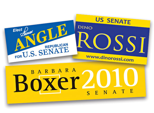
* Kate Murphy in the NYT provides an analysis of the typographic choices of politicians vying for positions in the 2010 election cycle. Her conclusion: Candidates—of both parties—have made a conscious move away from Obama's '08 Gotham and other "modish fonts, choosing instead fonts that look like they were banged out on a vintage typewriter or carved into an ancient temple."
Read the full story here: http://www.nytimes.com/2010/10/31/fashion/31Noticed.html
* In his weekly column "Consumed," Rob Walker considers whether the adage "there's no such thing as bad publicity" applies to the Gap logo redesign fiasco. His conclusion? Maybe... http://www.nytimes.com/2010/10/31/magazine/31fob-consumed-t.html